


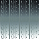

The first images is the redone after getting some comments. The changes I made was adding another line of text so there was an even number of lines to split up on top and bottom of the middle line, Adjusted the gradient so the faded section in the middle was a better transition, and finally I removed some of the border dead space around the edges.

These changes are very subtle, can you post the three original designs? What do you think about the changes, does it make the design successful or not? I really like how the center of the left design actually still has the word but its almost unreadable. Great.
I do think they were successful in the statement I was trying to make. In my other blog I explained to Robyn that I am using the definition of faded from the Urban Dictionary. And I wanted to represent the individual that is getting faded in life using gradient in the background, to make the word get lost or faded. The solid black on top representing the original individual and the white on bottom as the returned hollow individual. I didn’t point it out but I also added a stoke with 2 shades of grey lighter around the words in the middle to just be able to make them out. I used multi words in a row to symbolize the repetition of the getting faded event that most likely occurs constantly.
I’m gonna go ahead and give you the points, but you should of had a separate post for 2:1 on your feedback from exercise 2:2 (typography).